SA
The Cleaner
UI Artist

The Cleaner is a puzzle and visual novel game exploring censorship in game development
Information Architecture


Donuts! has two game modes: story and arcade mode to emulate arcade racers the gameplay was inspired by.
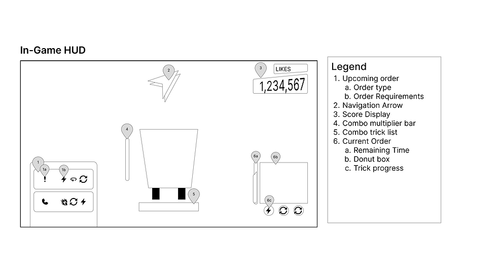


Because our gameplay has very high energy player movement and lively setting, we wanted the UI to match the personality of the world Donuts! takes place in. In the in-game HUD, UI elements are set to the lower half of the screen as when driving, the horizon line needs to be unobscured for the player to plan their upcoming route. In addition, all elements will be slightly skewed to match the chaotic, energy filled gameplay while having clear and simple iconography to be readable at a glance.
Design


Gameplay Mockups of UI assets in-game. When creating the UI for this game, I wanted to keep the elements grounded in physical office supplies such as notebooks, manila folders, and post-its to emphasize the grounded narrative that many game developers experience in their own studios.

Title card and logo created for The Cleaner. The half circle rings are designed to evoke a generic, corporate logo while the red and white arcs are intended to create the image of an eye looming over the game.